Customize a widget
The words, colours, launcher, position, language and behaviour of a widget, designed next to a live preview in the app.
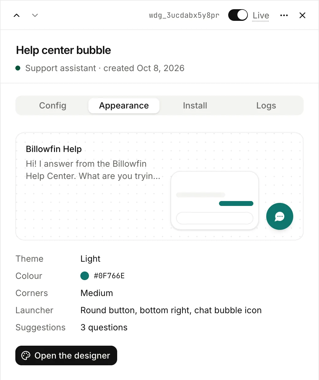
Open the widget’s Appearance tab, then Open the designer. The settings are on the left. On the right is the live widget on a sample page, in each format, on desktop or mobile.
Each change saves at once and shows in the preview. The preview is the real widget: questions there get real answers and cost credits. It also shows formats that are off, so you can design them first.
Words
The Words group of the designer.
| Setting | What it does |
|---|---|
| Title | The chat’s heading. If empty, the assistant’s name. |
| Subtitle | A line under the title, up to 80 characters, such as “Available 24/7”. If empty, the title is alone and centered. |
| Greeting | The first message a visitor reads. |
| Suggested questions | Up to four, shown as buttons before the first question. |
| Placeholder | The text in the empty question box. |
| Notice under the box | A short note on how answers are made. If empty, nothing shows. |
| Language of the buttons | The language of the widget’s own words. Answers always use the language of the question. |
Look
The Brand and Launcher groups of the designer.
| Setting | Options |
|---|---|
| Theme | Light, dark, or auto (follows the visitor’s system). |
| Colour | Any colour. Text on it is black or white, for contrast. |
| Corners | Square to round. |
| Message bubbles | Follow the corners, or always round. |
| Launcher | A round button, a button with a label, or a bar at the bottom centre (chat bubble format). The bar shows the placeholder and opens the chat in the middle of the screen, full screen on a phone. The bar can show an icon, and can be see-through. |
| Launcher size | Small, medium or large. |
| Icon | The launcher’s icon: chat bubble, message, question, sparkle, assistant or search. On paid plans, your own image (a logo or a face, shown round): PNG, JPEG, WebP or GIF, 256 KB at most. |
| Header icon | The icon in the chat’s header, the sparkle by default, or none. On paid plans, your own image, with the same formats. |
| Favicon | The tab icon of the hosted page. By default, made from your colour and icon. On paid plans, your own image: PNG, JPEG, WebP, GIF or ICO, 256 KB at most. |
| Position | Bottom right or bottom left (round button and button with a label). |
You can also set the three images through the API or with lookio widgets set-image (launcher, header or favicon).
Behaviour
These settings are in the Config tab: Sources under Answers, the others under Visitors. The footer link is in the designer. Save preferences applies the changes. Reset cancels the changes not saved.
| Setting | What it does |
|---|---|
| Sources | How answers show where they come from. See below. |
| Remember the conversation | On, a follow-up question uses the previous ones. Off, each question stands alone. The messages stay in Logs. |
| Visitors’ chat history | On (the default), a visitor who comes back in the same browser finds their past chats under Past chats. Off, each visit starts a new chat. Turn it on again and the kept chats come back. In the API: settings.visitor_history. See Visitors’ conversations. |
| Feedback | On (the default), visitors see a thumbs up and down under each answer, and can add a comment. They can change or remove their thumb. Off, there are no thumbs and Lookio refuses new ones. It keeps the old ones. In the API: settings.feedback. |
| Powered by Lookio | A small link under the chat. Always on the free plan. Paid plans can hide it. |
Sources
Choose how answers show their sources. Lookio applies the choice on its servers: an address that you hide never reaches the visitor’s browser.
| Mode | What visitors see |
|---|---|
| Numbered, with links (default) | Answers cite [1], [2]. A click on a number opens the source in a new tab. Hover, or a tap on a touch screen, shows the passage. A source without an address shows the passage on click. |
| Numbered, no links | The same numbers, titles and passages, without addresses, so visitors stay on your site. Hover shows the passage. A click or a tap keeps it open. |
| Links in the text | The answer links its own words to the source pages, with no list. Only sources with a web address get a link. To set the style, write it in the assistant’s guidelines, for example “link at most once per paragraph”. |
| Hidden | No source at all. |
In Logs, the widget’s conversations always show every source, whatever the mode.